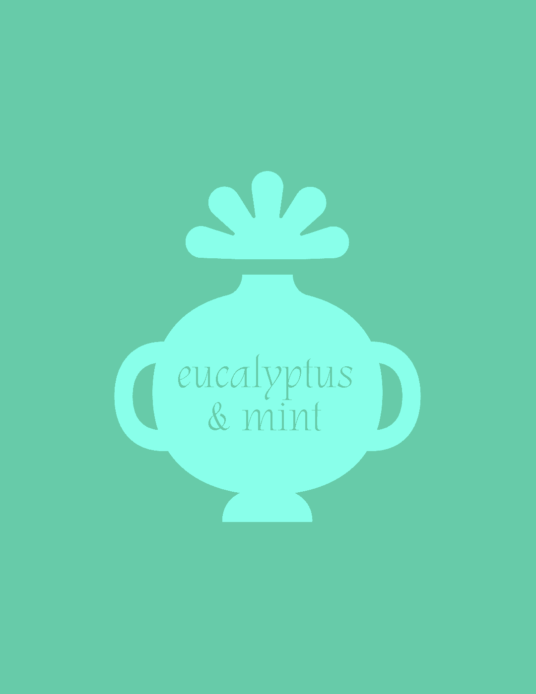
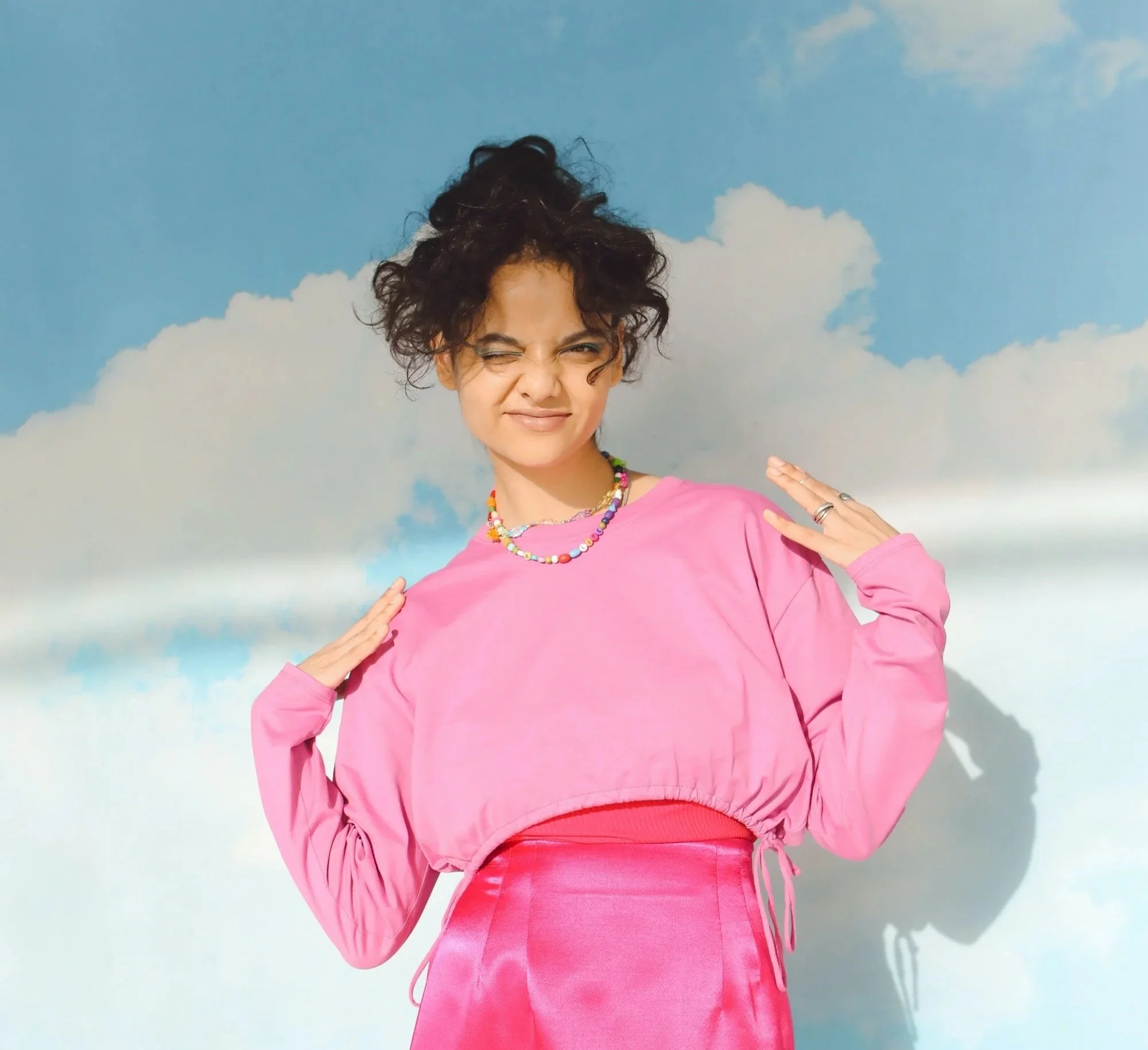
Fiore

Branding ✿ Packaging

Fiore (meaning ‘flower in Italian’) is a startup natural deodorant brand that needed a fresh brand identity and packaging design. Although they’re sustainable and organic, they didn’t want that to be the focus point of the brand. Instead, they aim to be the go-to natural deodorant for the modern 20-something woman on the run to help her feel fresh and feminine.

Three women posing outdoors with cloudy sky background, the word 'FIORE' overlayed in the center.
A stylized drawing of a perfume bottle labeled 'eucalyptus & mint' with a flower on top.
Young woman in pink outfit making a playful expression against a cloudy sky background.
Colorful packaging of natural deodorants and soap bars in pastel pink, purple, green, and blue with floral and botanical designs arranged on a pink background.
Pink container of Fiore natural deodorant labeled 'wild rose' with a shadow cast on a white background.
A mint green deodorant stick labeled 'Fiore Natural Deodorant' with eucalyptus and mint scent, 20ml/1oz size, positioned vertically against a plain white background with a shadow.
A purple container of Fiore natural deodorant with jasmine and peony scent, standing on a white surface, casting a shadow.
Three light green boxes, two with product packaging and one with an open flap revealing a main design with a small icon of a teapot, all placed on a light green background.
Collage of nine images promoting fresh and clean beauty and skincare products and messages, featuring diverse women, a dog on purple satin, skincare product, and a social media post with celebrities and text about falling into a pit.
Pink packaging box with abstract line art of a rose and the words 'FIORE' and 'wild rose', indicating natural deodorant, organic, cruelty-free, aluminum-free, and paraben-free, on a light pink background.